Discovery
Native-friendly
Discovery-style native advertorial
This is the lighter, curiosity-led style that often pairs well with native traffic because it feels more like a useful discovery than a hard sell.
Best for: Native ads, travel deals, consumer tools, and curiosity-led angles that should feel easy to read and easy to click through.
When it fits
- The ad promises a useful trick, shortcut, or discovery.
- You want a softer entry into the offer than a classic VSL-style page.
- The page should feel skimmable on mobile while still pre-selling the click.
Typical flow
- Discovery hook and light editorial framing.
- Benefits, examples, or use-case explanation.
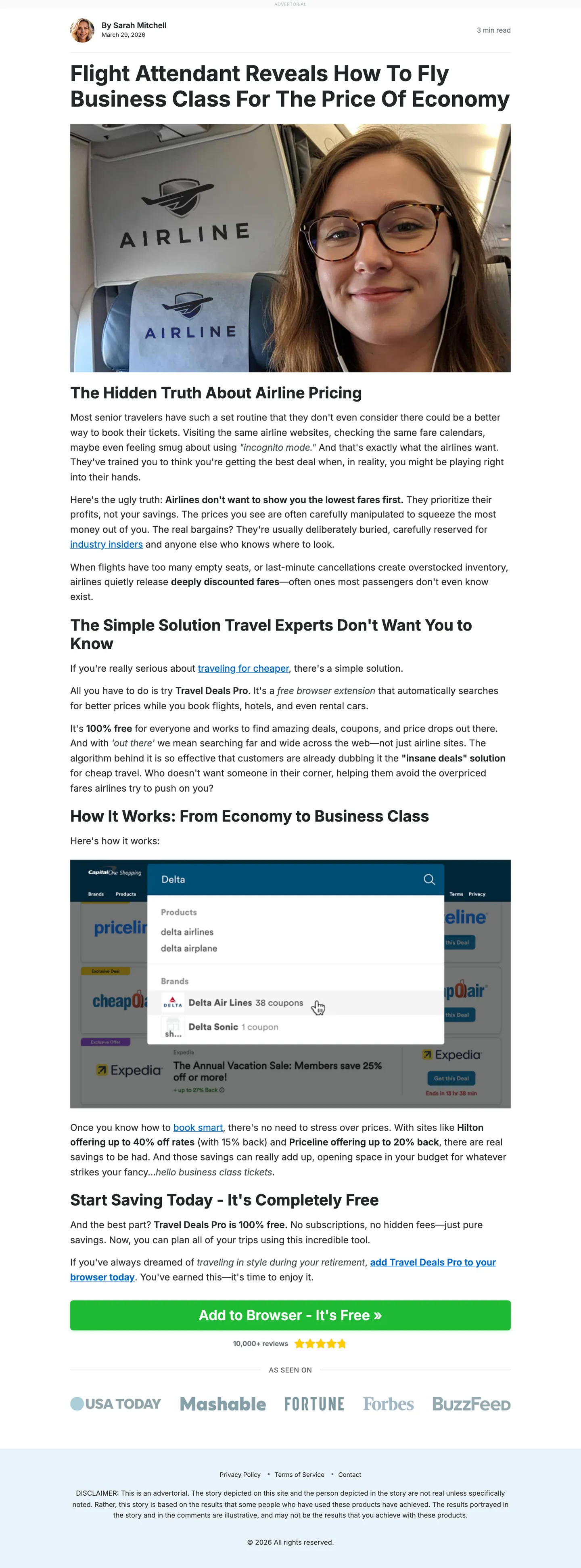
- Proof, screenshots, and trust builders.
- CTA into the app, tool, or offer page.