Browse 23 full-page advertorial examples built in LandGoose for ecommerce, ClickBank, lead generation, app installs, finance, and native ads. Open each preview to study the hook, pacing, proof, and CTA flow, then use the structure notes below to choose the right format for your campaign.
23 full-page advertorial examples
Browse examples built in LandGoose across ecommerce, affiliate, lead generation, app-install, finance, and native-ad funnels. Open any card to inspect the full page.
 View full preview
Ecommerce
View full preview
Ecommerce
Wellness Discovery Advertorial
Long-form discovery page for a physical wellness product. View full preview
Ecommerce
View full preview
Ecommerce
Foot Massager Ecommerce Advertorial
Classic physical-product pre-sell with problem setup and product reveal. View full preview
Ecommerce
View full preview
Ecommerce
Foot Massager With Sidebar CTA
Long-form product story with a stronger side CTA pattern. View full preview
Ecommerce
View full preview
Ecommerce
Simple Foot Massager Advertorial
Cleaner ecommerce advertorial for a faster product education flow. View full preview
Ecommerce
View full preview
Ecommerce
Joint Relief Evening Ritual
Routine-led health advertorial built around daily frustration and relief. View full preview
Ecommerce
View full preview
Ecommerce
Poupanda Product Advertorial
Product-led advertorial for testing a softer ecommerce angle. View full preview
ClickBank
View full preview
ClickBank
Vision Health VSL Advertorial
Short-form affiliate bridge page before a VSL or sales page. View full preview
ClickBank
View full preview
ClickBank
Diabetes Health Advertorial
Health-offer pre-sell with a direct-response education flow.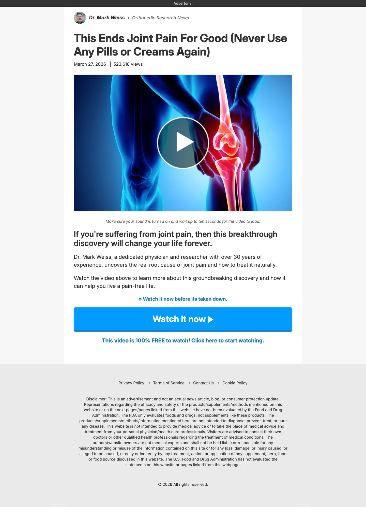 View full preview
ClickBank
View full preview
ClickBank
Joint Health Advertorial
Affiliate-style page for a pain-aware health audience. View full preview
ClickBank
View full preview
ClickBank
Prostate Health Advertorial
Problem-mechanism-benefit flow for a mature health offer.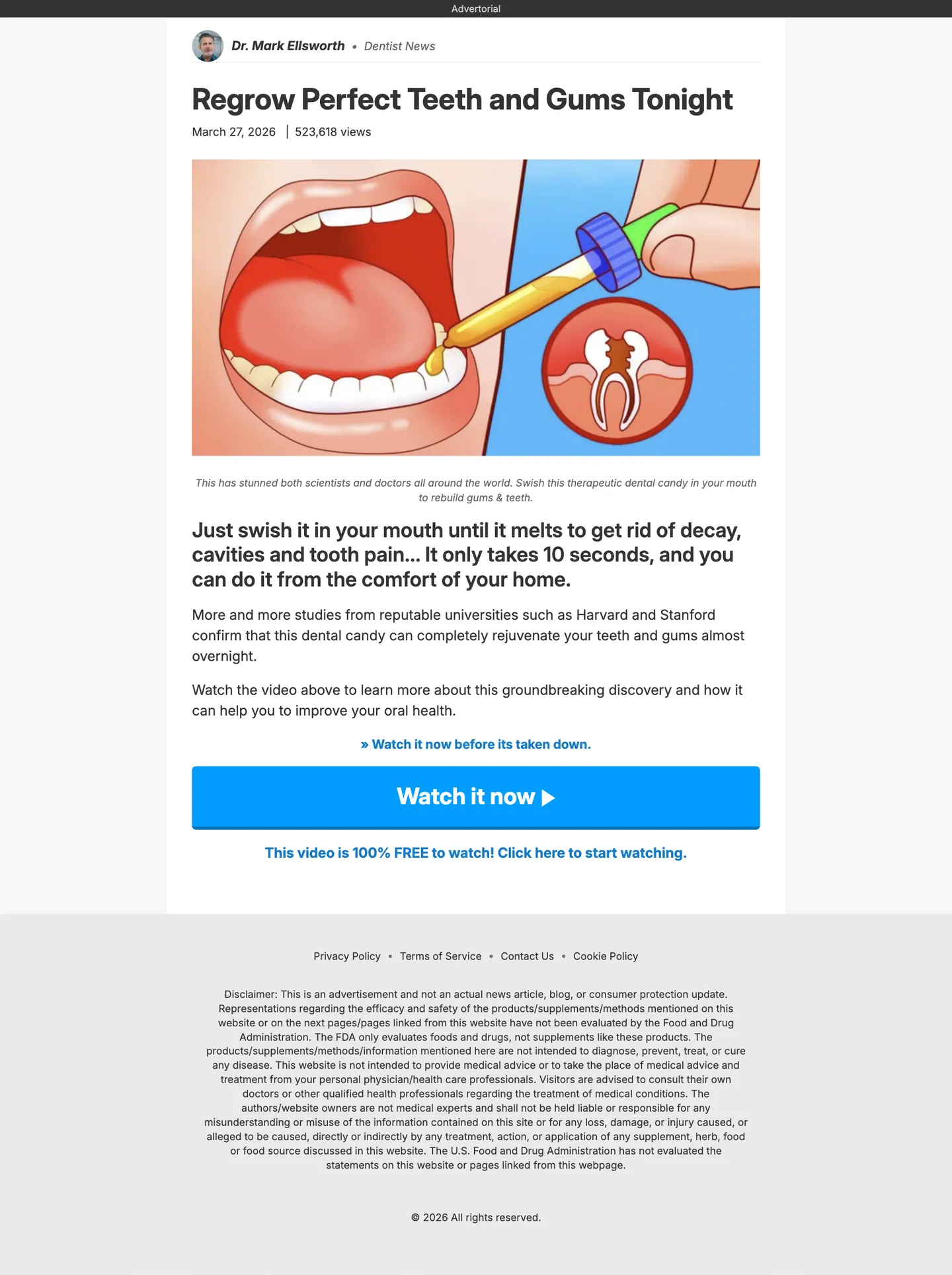 View full preview
ClickBank
View full preview
ClickBank
Teeth Health Advertorial
Short health advertorial for a clear consumer pain point.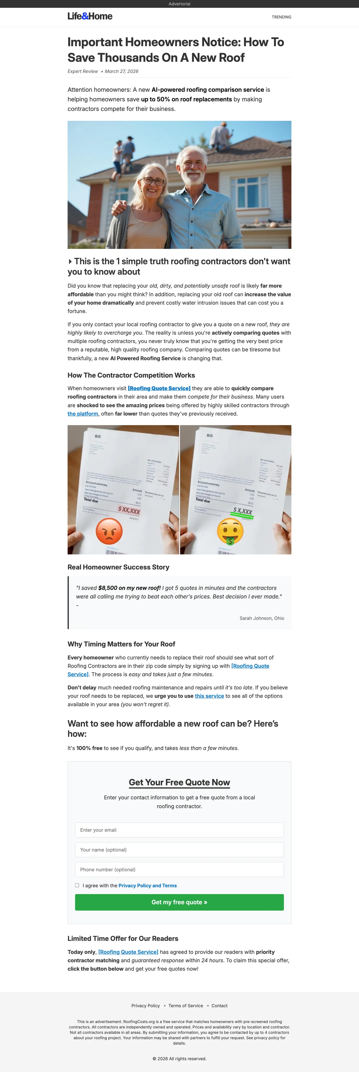 View full preview
Lead Gen
View full preview
Lead Gen
Roofing Lead Generation Advertorial
Local-service pre-sell designed to warm up quote requests.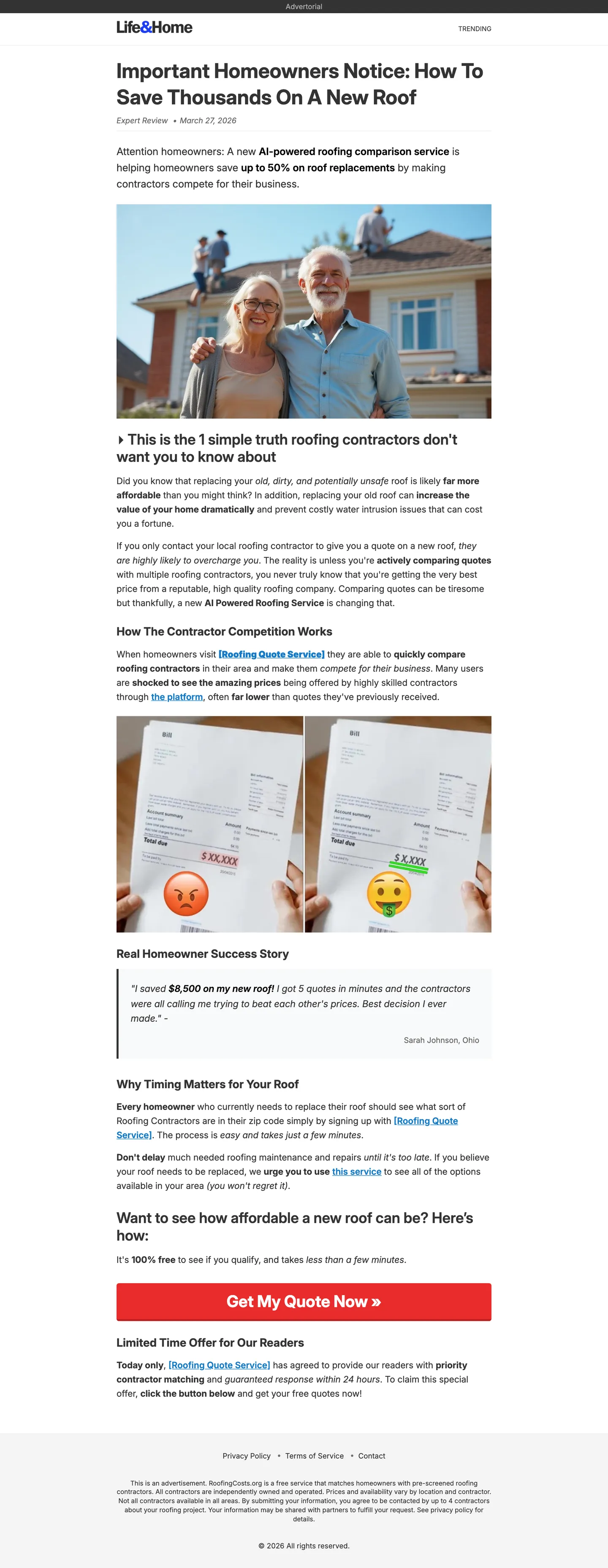 View full preview
Lead Gen
View full preview
Lead Gen
Roofing Comparison Advertorial
Comparison page for higher-consideration local services.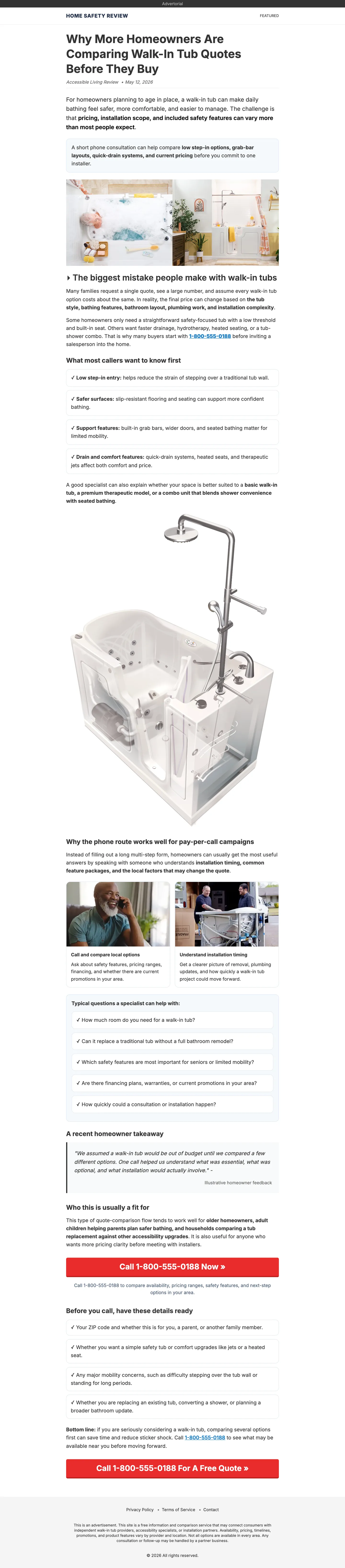 View full preview
Lead Gen
View full preview
Lead Gen
Walk-In Tubs Comparison
Guided comparison advertorial for senior-focused lead generation.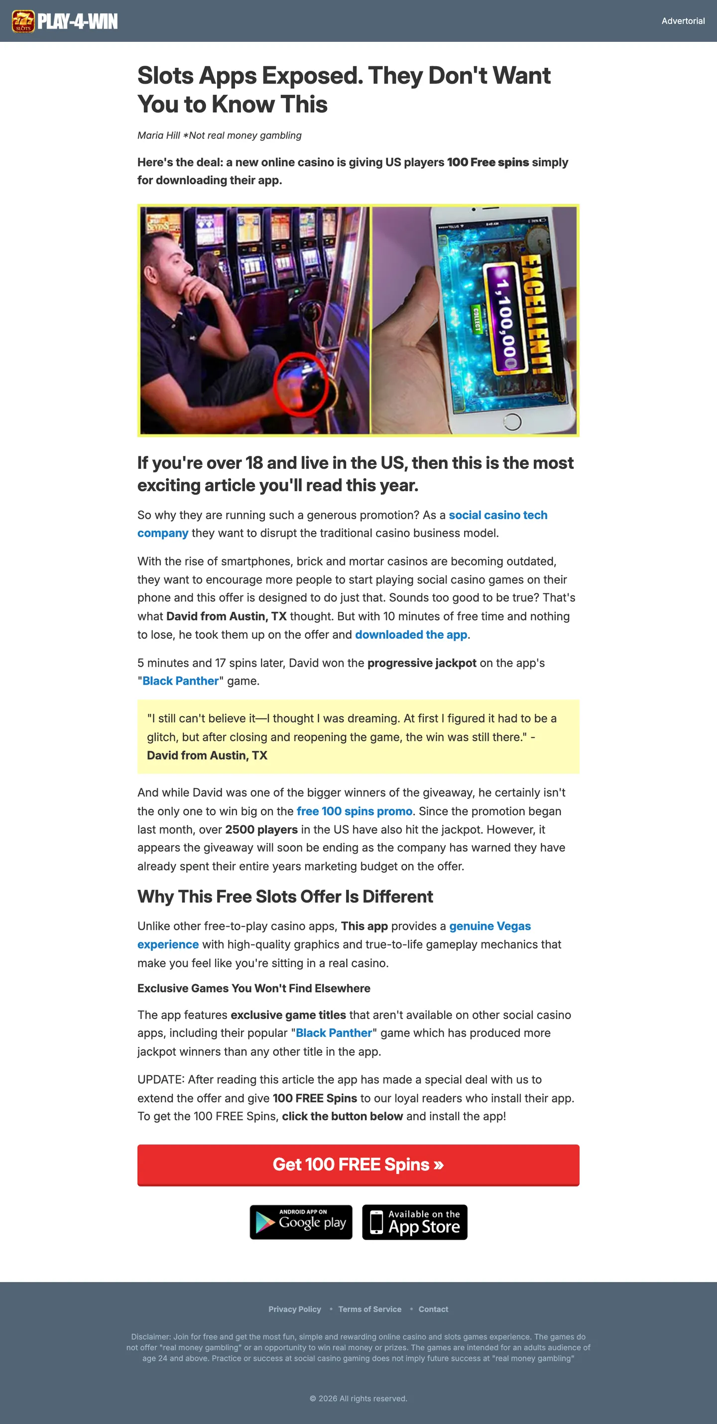 View full preview
App Install
View full preview
App Install
Casino App Download Advertorial
Medium-form app-install page with fast feature education.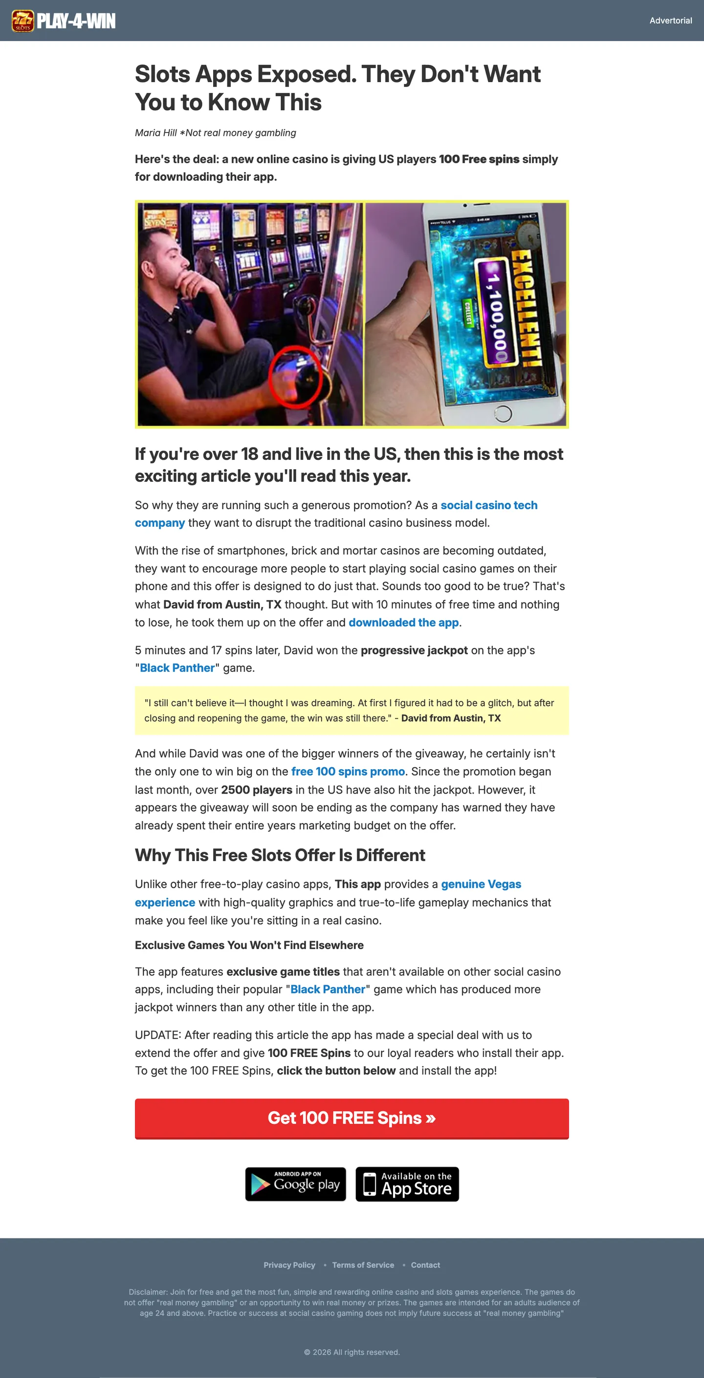 View full preview
App Install
View full preview
App Install
Dynamic App Download Advertorial
App-install page variant with a more campaign-ready structure. View full preview
News Style
View full preview
News Style
Hearing Specialist News Advertorial
Authority-led editorial page for an assisted-hearing offer.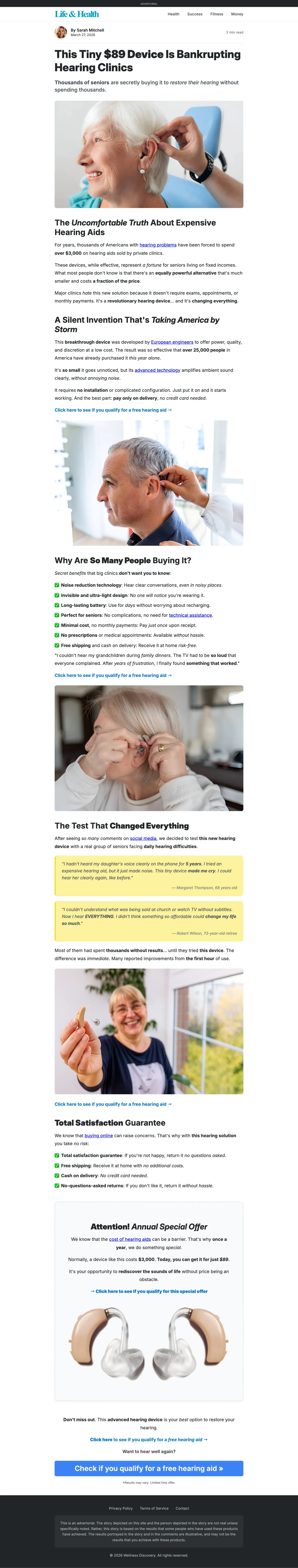 View full preview
News Style
View full preview
News Style
Hearing Medical News Advertorial
Medical-news framing for a trust-heavy product category.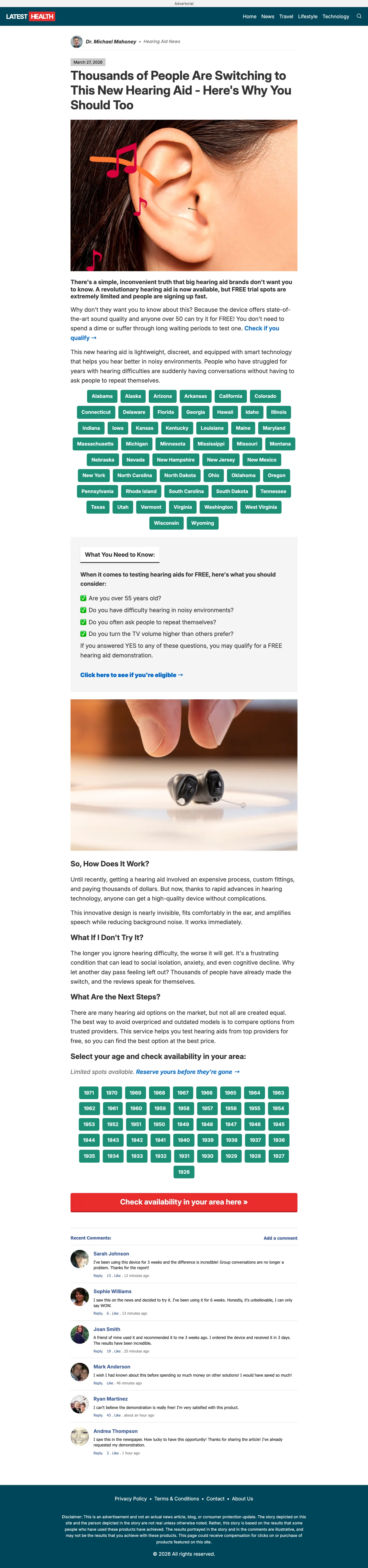 View full preview
News Style
View full preview
News Style
Hearing Aid Product Advertorial
Product education page for a senior and health audience. View full preview
Finance
View full preview
Finance
Crypto News Advertorial
News-style finance advertorial for curiosity-led traffic. View full preview
Finance
View full preview
Finance
Crypto Story Advertorial
Story-driven finance advertorial for a more narrative angle.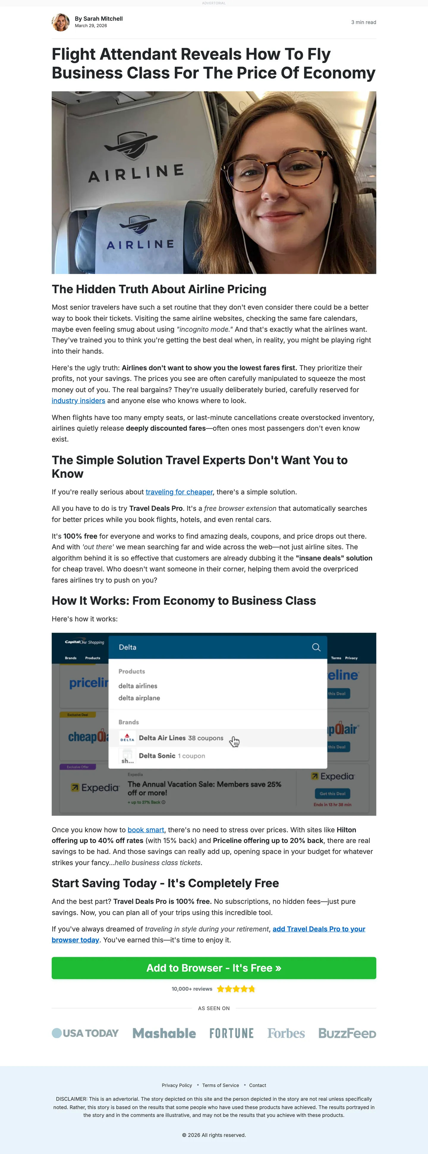 View full preview
Native
View full preview
Native
Browser Travel Deals Advertorial
Discovery-style native page for a browser or travel-deal offer.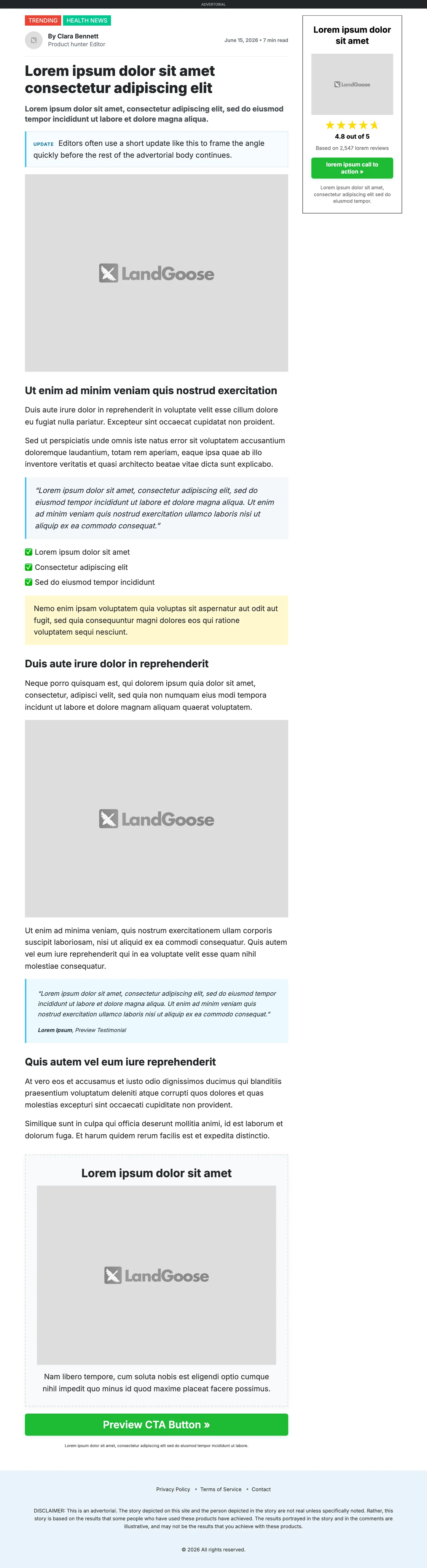 View full preview
Native
View full preview
Native
Flexible Advertorial Template
Flexible advertorial shell for testing multiple angles and sections.How to Use These Advertorial Examples
An advertorial example is most useful when you study the selling sequence, not only the design. Look at what the page explains first, when the offer appears, where proof is introduced, and how the call to action becomes the next logical step.
The gallery above contains complete page previews rather than isolated hero sections. That makes it easier to compare short bridge pages with longer ecommerce, lead generation, app-install, finance, and native-ad flows.
Start with the job the page needs to do
Before choosing a layout, decide what must happen between the ad click and the offer. A reader may need a quick mechanism explanation, a product comparison, a relatable story, more trust, or a clearer reason to continue.
Match the advertorial to that job. A short affiliate bridge page should not be stretched into a long article just because a long template looks impressive. An unfamiliar ecommerce product should not be forced into a thin page if the buyer still has basic questions.
Treat each page as an example, not performance proof
These previews demonstrate advertorial structures that can be built and adapted in LandGoose. They are not claims that a specific design or angle will automatically convert for every offer.
Use them as starting points. Replace the claims, proof, reviews, product details, and images with material you can support, then measure the full path from advertorial engagement to the final conversion.
Want to turn one of these structures into a campaign page? Start your 7-day LandGoose trial, or see how LandGoose works before you build.
Advertorial Formats Covered in the Gallery
Different campaigns need different amounts of education and persuasion. The gallery groups the examples by the funnel role they are designed to support.
Ecommerce advertorial examples
The ecommerce examples use product stories, daily frustrations, demonstrations, reviews, and product reveals to prepare cold traffic before a product page or cart. They range from cleaner product explainers to long-form discovery pages with more objection handling.
This format is useful when a generic product page does not provide enough context for a new visitor. For a deeper breakdown, read advertorials for ecommerce.
ClickBank and affiliate advertorial examples
The ClickBank-style examples are shorter direct-response bridge pages for offers where a VSL or sales page performs most of the closing. Their job is to connect the ad angle to one problem, mechanism, or discovery without repeating the entire sales presentation.
Study how quickly these pages establish relevance, how early the CTA appears, and whether the transition into the destination offer feels consistent with the original ad.
Lead generation advertorial examples
Lead generation pages need to explain why requesting a quote, checking eligibility, or starting a form is worthwhile. The roofing and walk-in-tub examples use comparison and education to reduce uncertainty before the lead step.
The CTA should clearly explain what happens next. A reader considering a quote needs a different transition than someone buying a low-cost physical product.
App-install advertorial examples
App-install pages usually sit between a short landing page and a long ecommerce advertorial. They need enough copy to explain the use case, show the interface or benefits, and reduce uncertainty without slowing down the install.
The strongest sections to inspect are the opening use case, screenshots, feature proof, trust signals, and the final handoff to the app store or installation step.
News-style advertorial examples
News-style and editorial advertorials frame the offer as a report, discovery, specialist explanation, or consumer story. This can create a more natural reading experience, but the page should still make its promotional nature clear and avoid implying independent editorial endorsement when none exists.
Use this format when explanation and authority matter, not simply because a news-like header looks credible.
Finance and native-advertising examples
Finance and native-ad examples often begin with curiosity, a trend, or a discovery angle. The page then needs to deliver enough useful context to justify that hook before transitioning into the offer.
Message continuity is especially important. The first screen should expand the promise made by the ad instead of switching to an unrelated sales pitch. See how to send native ads to an advertorial for the complete click-to-page workflow.
The Common Advertorial Page Sequence
The length and presentation can change, but many effective advertorials follow a similar progression:
- a headline, opening lead, and first visual that match the ad angle
- a recognizable problem, desire, or buying situation
- an explanation of why familiar alternatives may be insufficient
- a mechanism, discovery, comparison, or product insight
- a clear introduction to the product or next step
- relevant proof placed near the claim it supports
- objection handling around trust, effort, price, or suitability
- a CTA that accurately describes what happens after the click
This is not a mandatory formula. It is a useful diagnostic sequence for finding gaps. If the page asks for a click before explaining the offer, or makes a large claim before showing relevant proof, the transition will usually feel abrupt.
LandGoose gives you this structure inside an editable advertorial workflow, so you can spend less time rebuilding layouts and more time testing the angle. Build your first advertorial with LandGoose.
Seven Advertorial Structures and Why They Work
The same product can support several advertorial angles. These seven structures describe the main persuasive route through the page, while the gallery shows how those routes can look in different markets.
1. Personal story advertorial
A personal story begins with a recognizable experience, frustration, or discovery. The product appears as part of the journey rather than as the opening pitch.
Best for: health, beauty, lifestyle, and problem-solution offers where the reader can identify with a specific situation.
What to study: how quickly the story establishes relevance, when it transitions from experience to explanation, and whether the proof supports the story instead of interrupting it.
2. Review advertorial
A review advertorial evaluates what the product does, who it fits, what stands out, and what limitations or alternatives the buyer should consider. It works because the reader is already in an evaluation mindset.
Best for: ecommerce products, software, gadgets, subscriptions, and offers where practical details influence the decision.
What to study: the review criteria, proof behind the conclusions, balance between benefits and limitations, and the transition from evaluation to the product page.
3. Comparison advertorial
A comparison page helps a category-aware reader choose between approaches, product types, or providers. The comparison criteria should be useful and consistent rather than designed only to make one option win.
Best for: competitive ecommerce categories, lead generation, higher-consideration purchases, and readers actively comparing alternatives.
What to study: which criteria appear first, whether the differences are supported, and whether the recommendation follows naturally from the comparison.
4. Problem-solution advertorial
This direct structure opens with a concrete problem, explains why common attempts fall short, and introduces the offer as a possible path forward. It is easy to follow when the audience already recognizes the pain point.
Best for: pain-aware audiences and products with a clear, explainable use case.
What to study: specificity in the problem section, the logic of the mechanism, claim support, and whether the product reveal arrives before the page becomes repetitive.
5. How-it-works advertorial
A how-it-works page builds interest by making the product, method, or mechanism understandable. Education does more of the persuasive work than emotional storytelling.
Best for: unfamiliar products, software, technical offers, and products that become more credible once the reader understands the process.
What to study: how the explanation is divided into steps, where diagrams or demonstrations help, and whether the CTA appears after the reader has enough context.
6. Testimonial-led advertorial
A testimonial-led page organizes the argument around customer experiences, screenshots, case studies, or other social proof. The surrounding copy explains why each piece of proof matters.
Best for: established offers with authentic, permissioned proof that reflects the target audience.
What to study: whether testimonials are specific, attributable, representative, and placed near the relevant claim. Avoid invented testimonials or unsupported transformations.
7. Expert breakdown advertorial
An expert breakdown uses a qualified perspective to explain the problem, evaluate alternatives, or clarify how a solution works. Authority should come from a real, relevant source rather than visual styling alone.
Best for: categories where trust, technical explanation, or professional evaluation materially affects the decision.
What to study: the expert's relevance, disclosure, supporting evidence, and whether the page distinguishes professional explanation from guaranteed results.
How to Choose the Right Advertorial Format
Choose the structure based on what the reader needs before taking the next step:
- use a personal story when identification and emotional context should come first
- use a review when the reader needs practical product details
- use a comparison when the audience already understands the category
- use problem-solution when the pain point is clear and immediate
- use how-it-works when understanding the mechanism increases trust
- use a testimonial-led page when you have strong, relevant proof
- use an expert breakdown when a qualified explanation genuinely helps the decision
Traffic source matters too. A native-ad click may need a softer editorial transition, while a high-intent search visitor may prefer a direct comparison or review. The destination also changes the page: a cart click, VSL, app install, quote form, and booked call require different CTAs.
Once you know the format you want to test, open LandGoose to explore the workflow or start your free trial and build the page.
What to Study in Every Advertorial Example
When you inspect a preview, review the page in this order:
- Message match: Does the headline continue the promise or idea from the ad?
- First-screen clarity: Can the reader understand the topic and reason to continue without scrolling?
- Section sequence: Does each section answer the next likely question?
- Proof placement: Is evidence close to the claim it supports?
- Product reveal: Does the offer appear at the right moment for the audience?
- Mobile readability: Are paragraphs, headings, images, and CTAs easy to scan?
- CTA continuity: Does the button accurately describe the destination and next step?
The most useful test is often the first screen. Compare a different headline, lead, or opening image while keeping the offer and downstream page stable. That gives you a clearer signal than changing the angle, layout, CTA, and destination at the same time.
For more focused ideas, review these advertorial headline examples and advertorial CTA examples.
Common Mistakes When Copying Advertorial Examples
- copying the visible layout without understanding the selling sequence
- reusing claims, reviews, or authority signals that do not belong to your offer
- choosing a long format when the reader only needs a short bridge
- using a news-style design to imply independent reporting or endorsement
- adding more sections without improving clarity or proof
- sending the CTA to a destination that does not continue the same message
- calling a template proven or high-converting without campaign evidence
The goal is not to make your page resemble every successful advertorial. It is to borrow a suitable structure and make the content more specific to your audience, traffic source, offer, and evidence.
Advertorial Examples FAQ
What is an advertorial example?
An advertorial example shows how a promotional page can use editorial-style copy, proof, images, and calls to action to prepare a reader for an offer. If you need the basic definition first, read what is an advertorial.
Which advertorial format is best for ecommerce?
Long-form ecommerce advertorials are a useful starting point when a product needs education, demonstrations, reviews, or objection handling before the product page. Simpler products and warmer traffic may need a shorter review or problem-solution page instead.
How long should an advertorial be?
The page should be long enough to answer the reader's important questions. A simple offer may need a short bridge page, while an unfamiliar or higher-consideration product may need a longer explanation. Page length should follow the selling job, not a fixed word count.
Can I use these advertorial examples as templates?
Use the examples as structural references, then rewrite the angle, claims, proof, images, and CTAs around your own offer and audience. Do not copy another brand's wording, testimonials, visual identity, or unsupported claims.
What should I test first on an advertorial?
Start with the headline, opening lead, first visual, and core angle because those elements determine whether the reader continues into the rest of the page. Keep the offer and destination stable while testing the opening so the result is easier to interpret.
From Advertorial Example to Published Page
Examples are useful when they shorten the path to a page you can actually test. LandGoose helps you move from an offer, source page, reviews, or rough angle into a structured advertorial you can edit, duplicate, translate, and publish.
When you are ready to build, start your 7-day free trial, use the AI advertorial generator, or follow the complete guide on how to build an advertorial page.